Branding & Website for a Cross-Cultural Tea Brand
Project Overview
Spark 7 is a new Chinese tea brand expanding into the UK. Starting with no existing identity or digital presence, the team needed a complete brand system, website, and product content. The aim was to introduce traditional Chinese tea in a way that felt modern, approachable, and relevant to both everyday tea drinkers and trade buyers in a Western market.

Process
The Challenge
Many users were curious about Chinese tea but lacked the context to make confident decisions. Product names, categories, and preparation methods felt unfamiliar. The goal was not just to translate these elements, but to clarify what makes each tea unique, its taste, aroma, health benefits, and who it’s suitable for, so that users could make informed and personal choices.
User Research
I conducted interviews and observations at tea tastings, pop-ups, and local markets to learn how people interact with Chinese tea in real settings.


Key insights:
· Users were interested but unsure how to choose
· Complex naming made the product feel distant
· Simple taste notes and guidance built trust and curiosity
Persona
To guide design decisions, I created two representative user profiles based on field observations and early feedback. These personas helped shape content structure, tone, and entry points for both retail and trade users.


Design
Visual Identity
To position the brand as calm, refined, and premium, I developed a visual system centred on a deep muted blue, paired with soft neutrals and clean sans-serif typography.
The final identity avoids the bold red traditionally used in Chinese branding, opting instead for a quieter, more modern tone that feels approachable to UK audiences.


Website Strategy & UX
To support both B2C and B2B users, I designed two clear flows within one system:
B2C Flow:
Product pages highlight flavour notes, brewing tips, and origin stories. A clean layout and soft visuals make the content easy to explore. Subscriptions and recommendations help encourage repeat visits.


B2B Flow:
The Trade section introduces sourcing services and cultural partnerships. A simplified contact form invites direct inquiries while keeping the experience focused and lightweight.


Outcome
The final website presents Spark 7 as a modern yet culturally grounded brand. It guides first-time visitors gently while giving trade partners a clear path to engage.
Additional Key Pages
· Homepage — highlighting brand values and guiding users through core offerings

· About Us — introducing the company’s background with a cross-cultural brand story

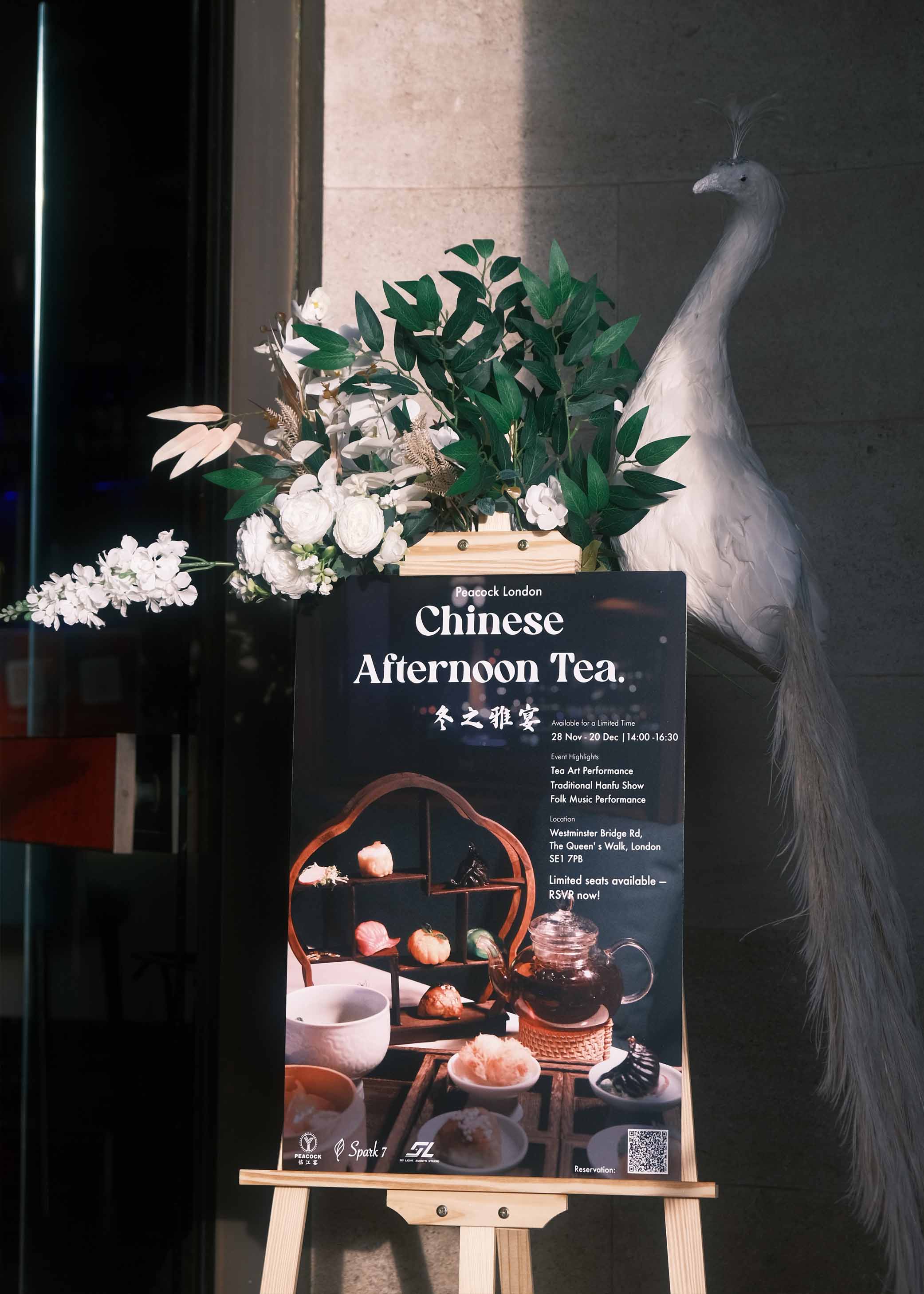
· Events — showcasing past collaborations and brand activities through an interactive timeline

Reflection
This project challenged me to take a culturally rich but unfamiliar product and turn it into a digital experience that feels clear, approachable, and relevant. It taught me how to simplify complexity through structure, language, and visual hierarchy, while still respecting the original depth of the product.
I also learned how to design for different user types within the same system, ensuring that both everyday tea drinkers and trade partners could find what they need with ease.
After launch, I plan to track user behaviour and make improvements based on real feedback to continue refining the experience.