Website Redesign for Home Extension Services
Project Overview
Build Team is a London-based company that provides design and construction services for home extensions. Their design website was outdated, which made it hard for users to understand their value or get in touch.
I was responsible for the redesign, working to improve structure, usability, and trust. I also created a new cost calculator tool to support lead generation. The new site improved mobile experience and brought in more traffic and enquiries.

Process
Challenge
· The old website had low user activity. However, we had to keep most of the content and structure for search engine reasons.
· We needed to maintain visual alignment with our sister brand Build Team, limiting flexibility in color and tone.
· I also had to design a new Cost Calculator tool that was easy to use and helped the sales team get better leads.
The challenge was not just visual improvement, but solving usability issues and aligning the site with real business outcomes while working within internal constraints.
Design Thinking in Motion
Before redesigning the site, we looked closely at how the old version worked. The layout felt loose, and it was hard for users to move through the pages. My work focused on reorganising the main content so it would be easier to follow and more helpful to visitors.
I tested layout ideas with simple sketches and wireframes to see what worked best before starting the final design.


These explorations helped ensure the final design wasn’t just visually clean, but also easy to use. Each page was planned to guide users step by step and support real actions.
Evolving into Visual Design
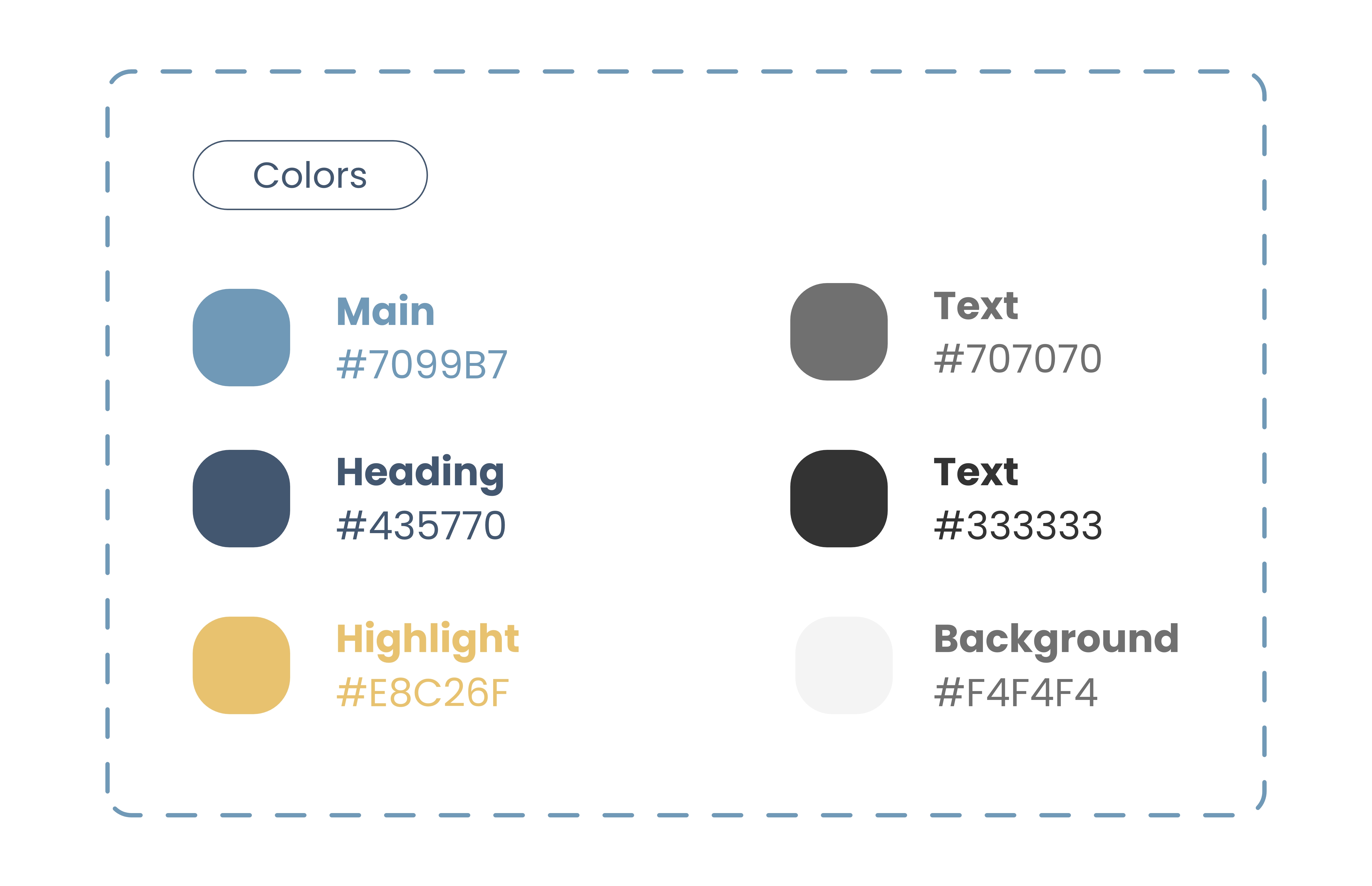
After the layout and content were in place, I worked on the visual system. The aim was to create a clean and modern look that still followed the brand’s style.
I adjusted the colour palette to increase contrast and guide focus. The original colours were quite soft, I changed how they were applied to make key elements stand out. This helped improve both clarity and usability.


Usability Testing & Iteration
During the design phase, I ran quick usability checks with team members. Their feedback led to several small but useful adjustments, such as better spacing and layout alignment. These changes improved the overall flow and made key actions more noticeable.


Outcome
The redesign transformed the site into a clearer, more intuitive, and business-aligned platform. The new structure and interface directly improved both user experience and measurable outcomes.


Final Design
After several rounds of refinement and internal testing, the final design delivered a clean, structured, and conversion-focused user experience. Each section was purposefully designed to guide users from initial interest through to action—with a focus on clarity, trust, and usability.
Final Design
Final Design
Results at a glance:
· +232.86% increase in website traffic
· Higher completion rates on the cost calculator
· Improved CTA visibility and engagement
What the Team Said
After launch, I received several genuine messages from colleagues across the team. Their feedback reflected both the success of the design and the trust I earned through the process.
“I rarely stepped in during your design process, because I trusted your judgment. That was my way of showing confidence in your work.”
— Declan, Product Manager
“Yonglin is a highly skilled and knowledgeable UI/UX Designer. She is not only friendly but also goes above and beyond to develop quality products. Moreover, I have seen her working her way through challenges. She uses innovative approaches to tackling and solving problems. She will be an asset to any company she joins in the future.”
— Sankhadeep, Design Team Developer
“Digital Designer. I'm impressed. First collaboration with one:)”
— Marcel, Build Team Developer
“Although it was short, I was impressed by your dedication and expertise. I wanted to let you know that I believe Build Team is fortunate to have someone as talented as you on their team.”
— Prescillia, Design Consultant